Why does Apple care more about form and design than function?

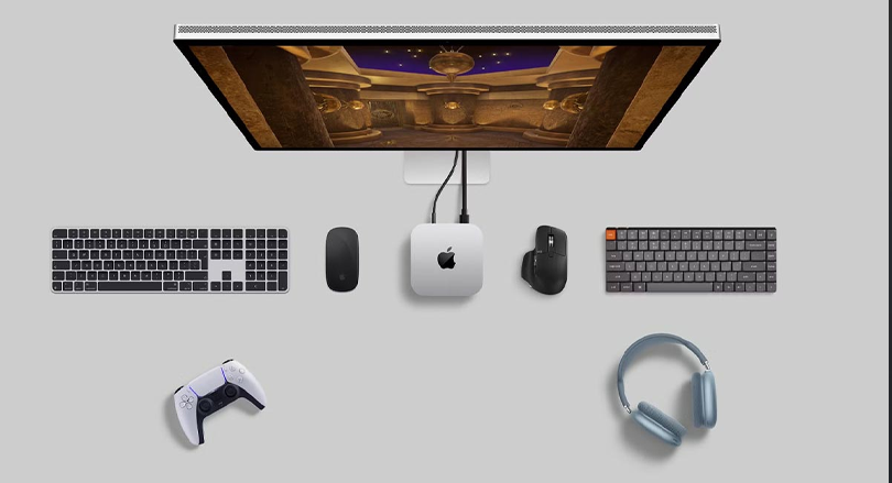
With the launch of its two latest products, Apple has again shown that it prefers form and design over function, as both the Magic Mouse USB-C and the new Mac Mini have strange design elements that make Apple's design process questionable.
It was in 2015 that Apple made a controversial decision and placed the Lightning charging port on the bottom of its Magic Mouse 2. This made it impossible to use the Apple mouse while charging. What is definitely a very strange design decision and at the same time was ridiculed by critics and users. While many people love Apple's Magic Mouse, they accept the oddity of placing the port underneath.
Almost a decade has passed since the production of this mouse, and despite the fact that Apple switched to using the USB-C port for charging, its position under the mouse has not changed. The release of the new Magic Mouse with a USB-C port gave Apple a great opportunity to improve the design, moving the charging port from the bottom to the end of the mouse. In this way, users could continue to use the mouse when the battery was low, while it was plugged in and charging, with very little impact on the appearance of the device.
The power button of the new Mac Mini is also in its lower part!
In the same week that Apple introduced its USB-C Magic Mouse, it also introduced another product: the redesigned Mac Mini, powered by the M4 and M4 Pro chips. While many have praised the hardware upgrade of these devices, it still looks weird from a design perspective!
Like the Magic Mouse, Apple has decided to use the bottom of the Mac Mini, but this time to house the power button. According to Apple, the right place to place the power button should be on the bottom, and to turn the device on and off, you must lift it.
Sure, as many Apple fans have pointed out, you won't need the power button very often, but that's a side issue. The key, which is an essential part of a product, should not be hidden away from the eyes and in a completely inaccessible place. Doing so is not user friendly. Even if die-hard Apple fans who can't admit that Apple did anything wrong think otherwise.
Although the new Mac Mini may be great and practical for some users, placing the power button under the device is not ideal.
Why should Apple stop prioritizing the appearance of gadgets?
There is no denying that Apple is known for creating beautiful products. But on the other hand, form should not take precedence over function. If you're building products for the masses, which Apple is following, end users should be the top priority when designing and developing products, and if that stops, it's going to hurt customers.
Having a beautiful design is important and many of us are fans of clean, minimal lines and great aesthetics. Anyway, when we pay a lot of money for a product, it should also have a good appearance, but on the other hand, this good appearance should never be prioritized over satisfying the user's needs from the product.
Apple obviously has its reasons for this approach and has evaluated the advantages and disadvantages of placing the necessary elements in certain places. However, it now appears that the company has not achieved the desired result with these particular aspects of the Magic Mouse and Mac Mini.


.png)
